Splice Rebrand
Building a creator-focused music brand from the ground up.

Splice is a music company. It’s the place where artists of all skills levels come to get started, unstuck, and find inspiration to create more and better music.
After 3 years of steady growth, the introduction of 2 first-of-their-kind creative marketplaces, and the saturation of the electronic dance music space, Splice sought to position themselves as a more genre agnostic brand in touch with the needs of today’s musicians.
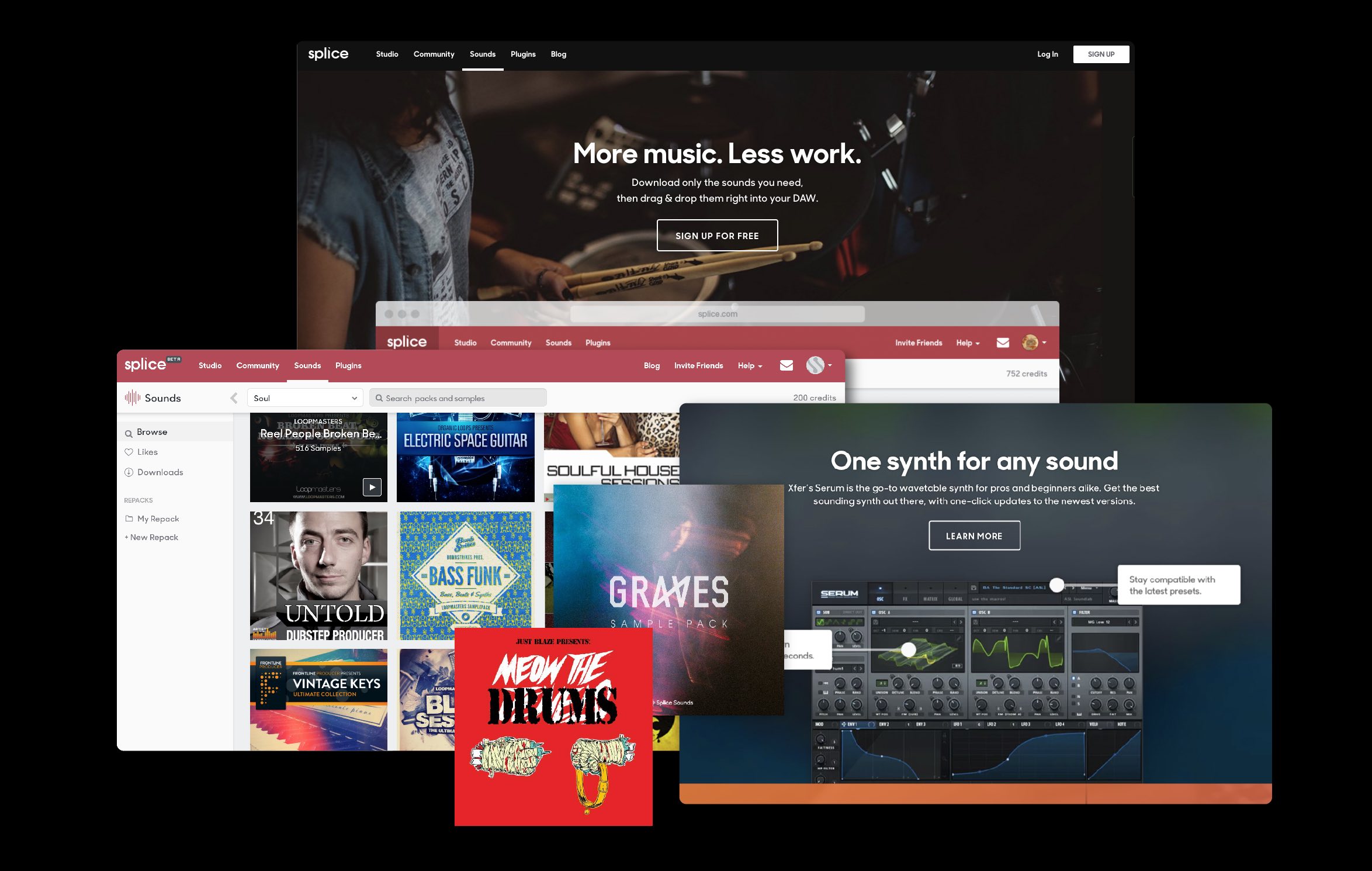
︎ Splice circa 2017
In late 2017, our small internal team set out to develop a new brand identity, strategy, and visual design system to do just this.
Strategy ︎ Mission, Purpose, & Values
What is a brand without a vision? How do you guide a growing team of 100+ people without words and concepts to align your collective thinking? Before approaching our identity, we took a hard look at the elements that made up Splice as a company, both the concepts that got us to where we are today and where we want to go in the future. We talked with Splice team members, users, and many other collaborators.

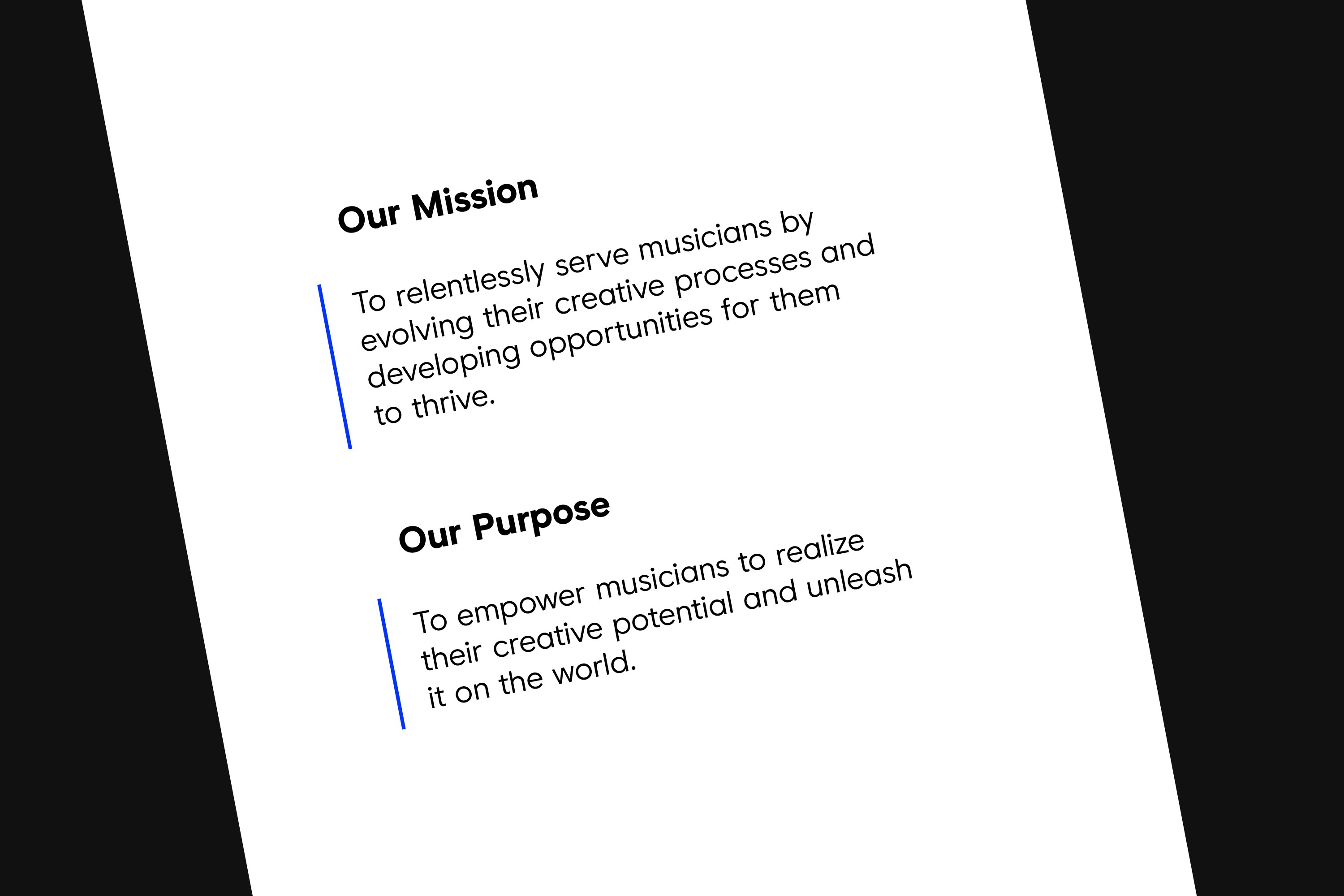
Splice’s Mission & Purpose ︎
Two things stood out: 1) our desire to serve and support individual artists above the industry at large, and 2) the drive to empower anyone who wants to make music to do so and share with anyone who wants to listen.
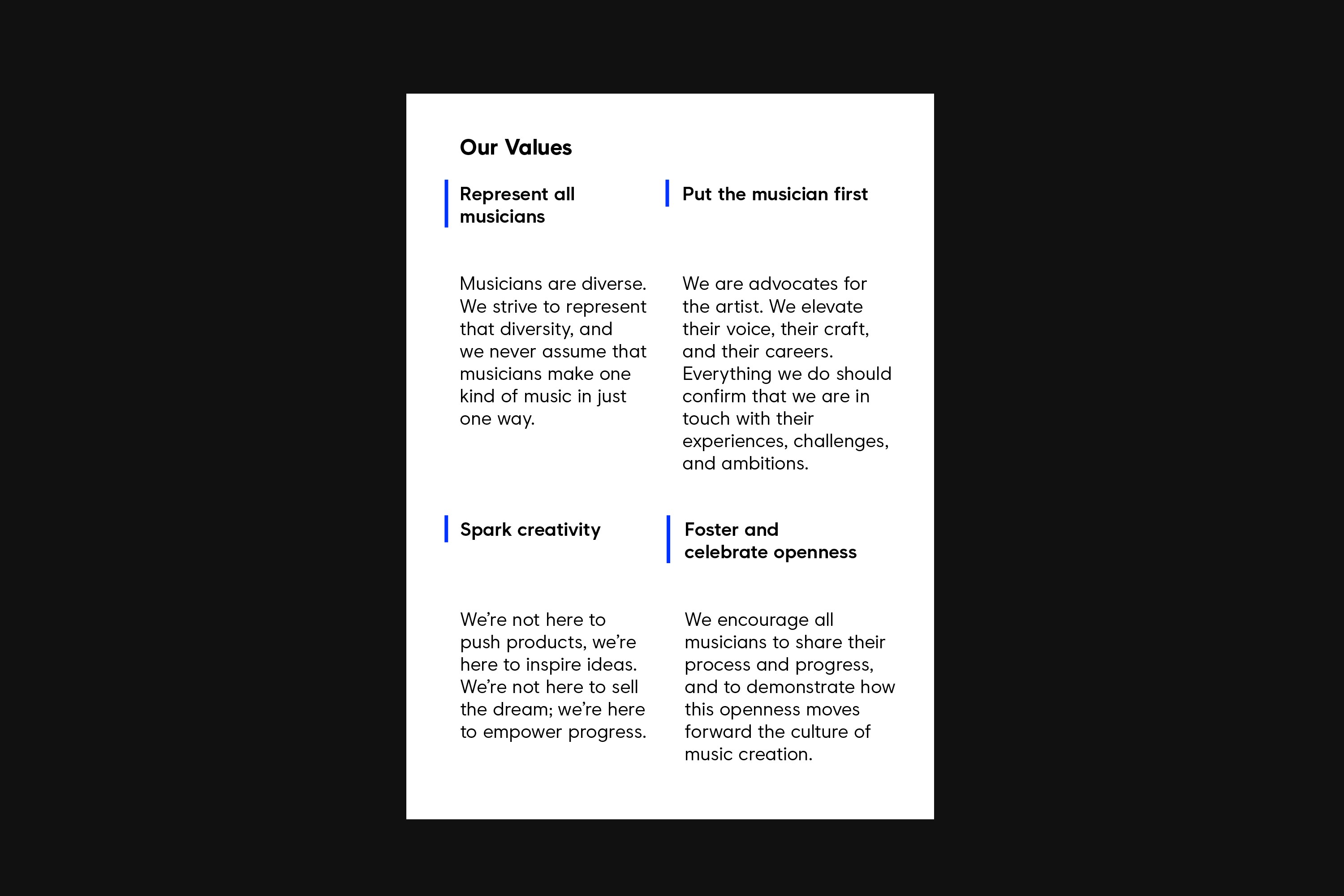
We used those findings in developing our company mission and purpose. To make these concepts easier to implement in our day-to-day work, we paired these statements down to 4 core values. They were broad enough to be applicable to every tweet, business decision, partnership, and piece of content, and focused enough to actually influence day-to-day thinking.
Visual Identity ︎ Logo & Mark
Splice had been using the same logo and mark for about 3 years. While they had established brand recognition within the electronic music market, it was time for a change as their product offering expanded.

Previous Splice Logo and palette ︎
We wanted to create a fresh take on the ‘S shape’ but one that felt less sharp, technical, and scaled better to fit new applications. We needed a mark that our users could recognize, rally around, and one that we could assign meaning to. Working closely with R/GA London and Order, we explored and experimented with a number of variations on the form.
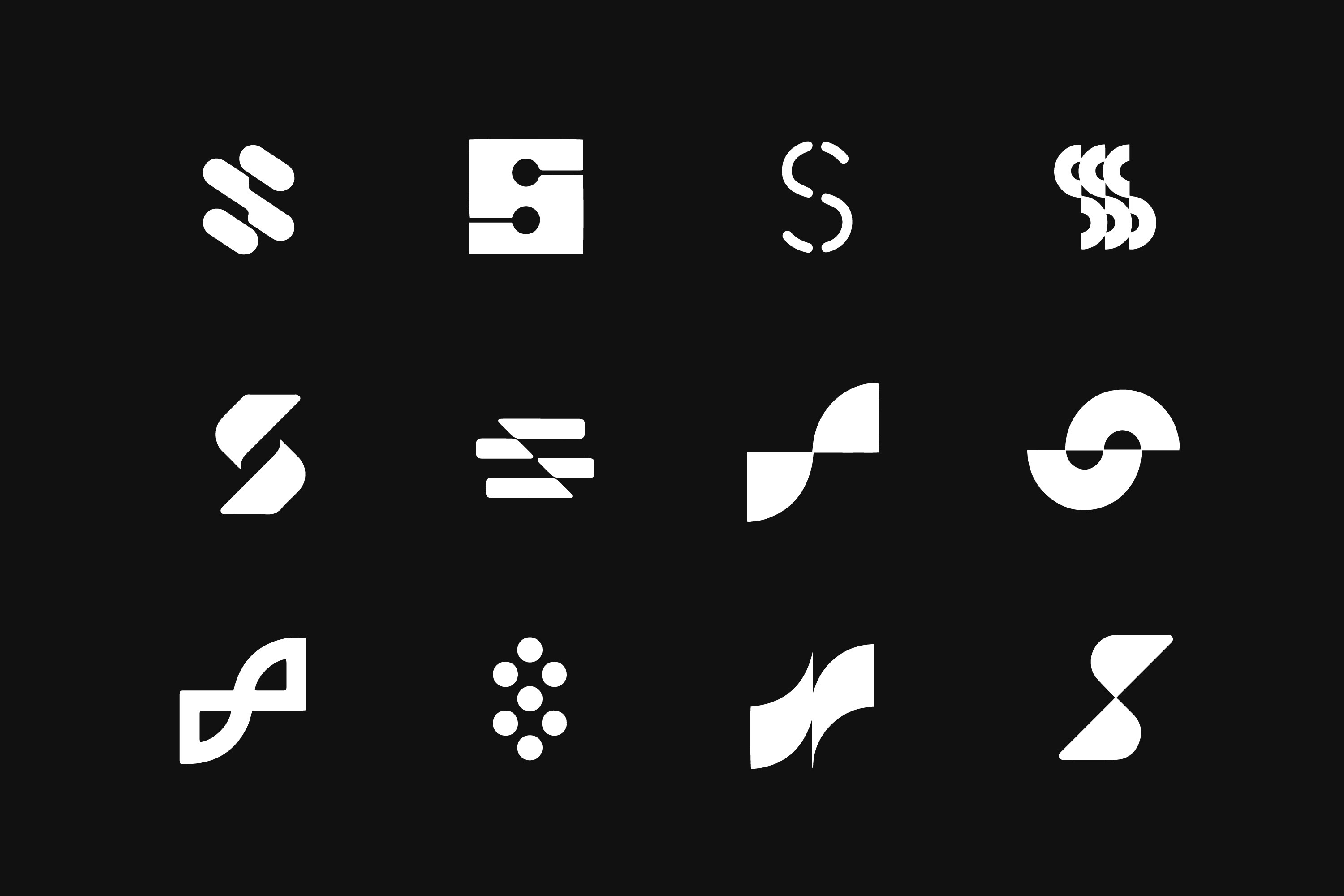
Splice glyph explorations ︎
We were drawn to the concept of Splice as an intersection — a place where ideas, people, and projects all come together.

Visual Identity ︎ Flow
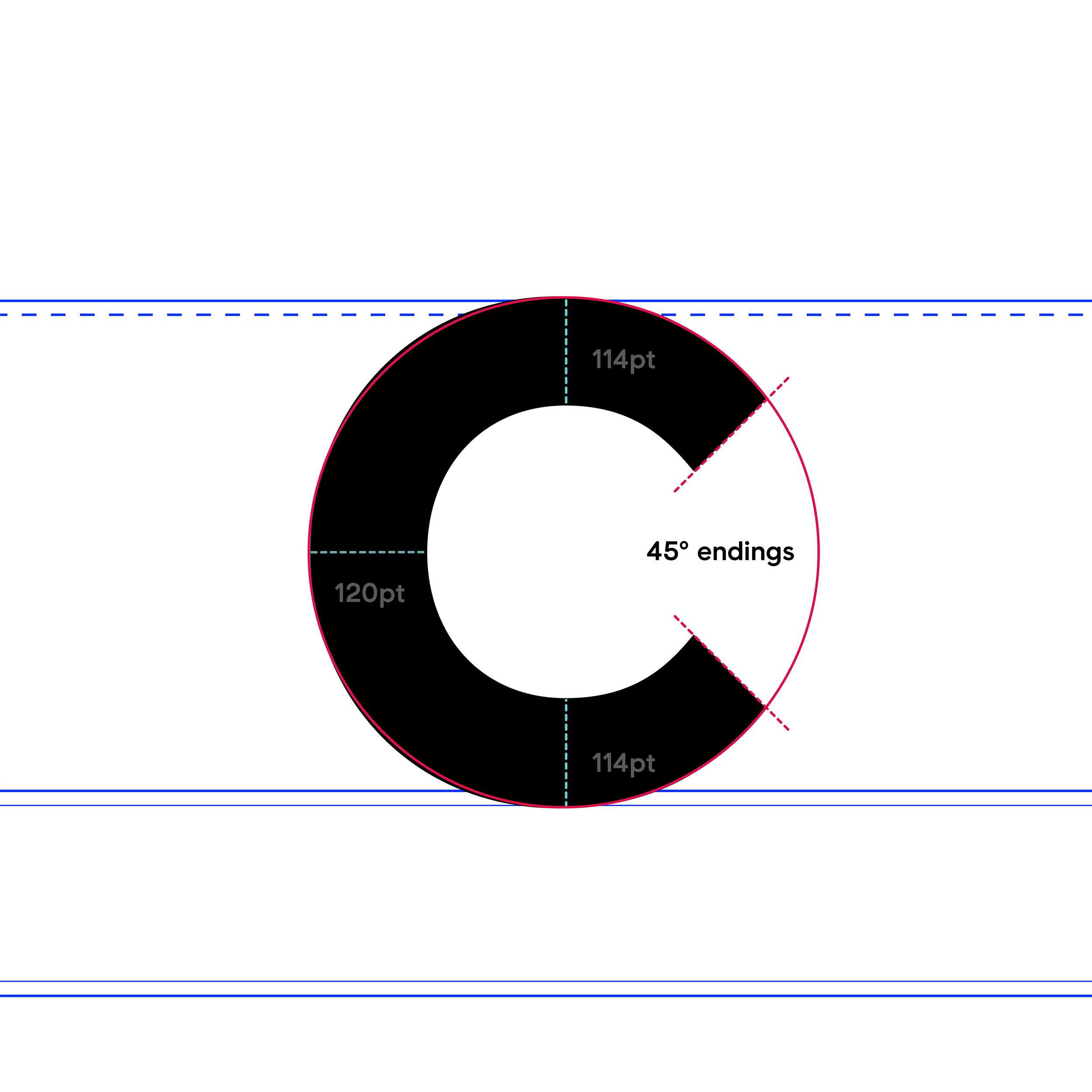
Using 45-degree angles and treating the glyph as an object to crop and manipulate, we developed a system that’s versatile, relatively simple to use, and loose enough to mold to new applications.


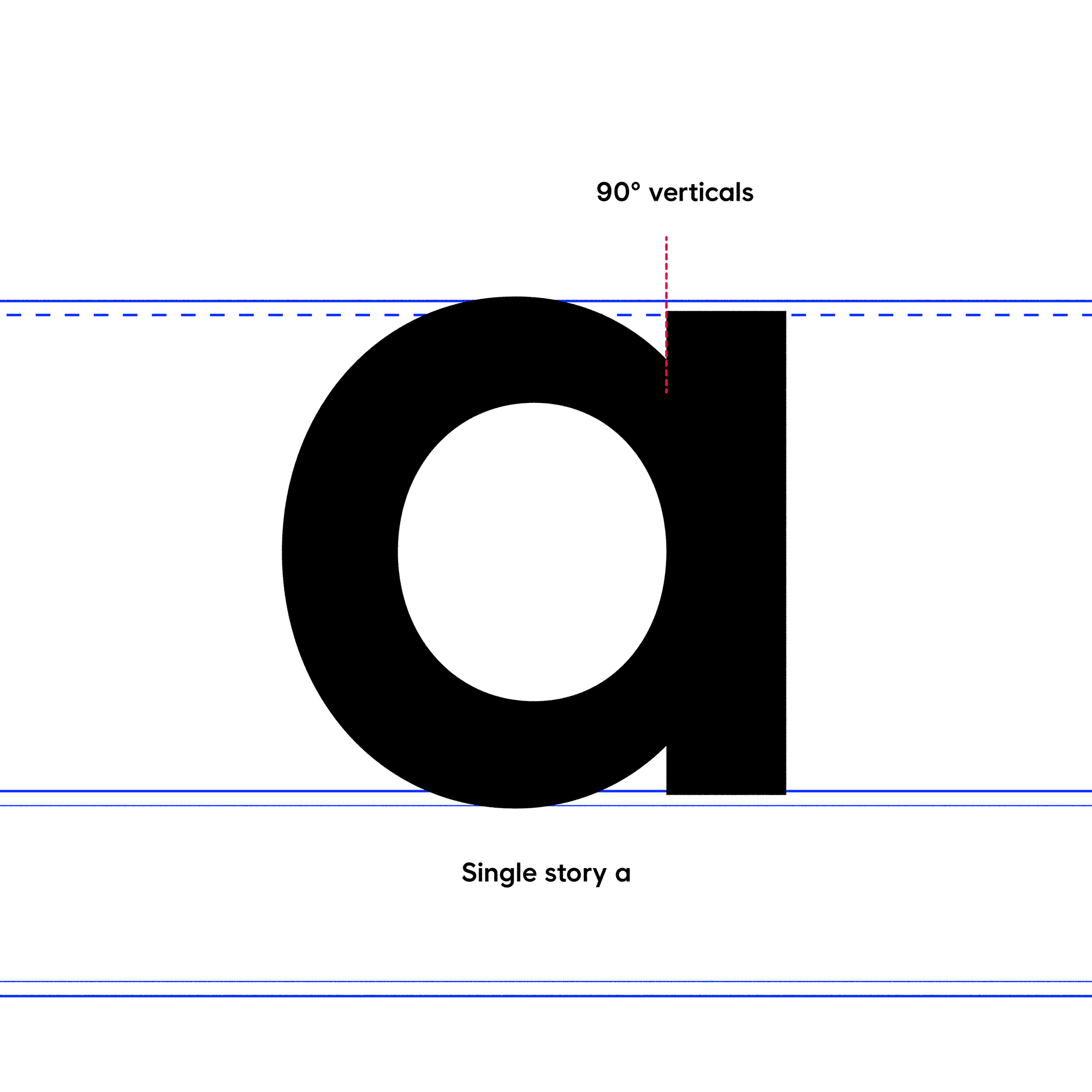
Visual Identity ︎ Typeface
When selecting a typeface, we sought something approachable, bold, and clear. Condensed faces felt confident, but were loud and difficult to work with in our product experience. Serifs were too editorial, and scaled poorly, while hybrid typefaces had too much character and distracted from our mark and messaging.
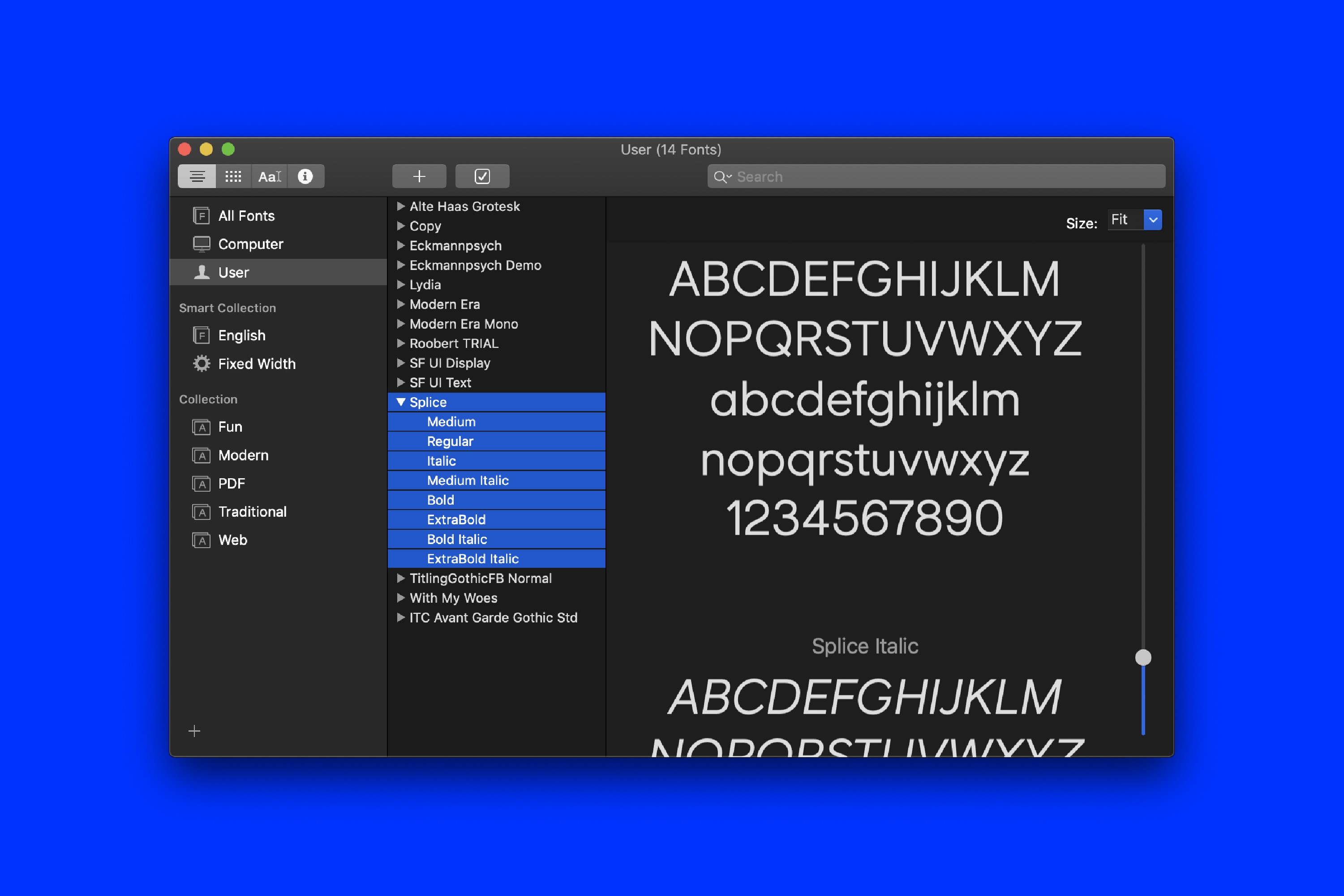
Modern Era by London type foundry OMSE caught our eye because of its similarity to our glyph; it was also legible in product and approachable. Working closely with OMSE, we developed a new wordmark for Splice using Modern Era as the starting point.
Splice Glyph / Workmark︎
OMSE took cues from the 45-degree angles found in the glyph by adjusting letterform endings, widening counters, and matching the roundness of the mark.

A few letterform adjustments︎
After settling on the wordmark, OMSE continued their work and developed a full character set based on their adjustments. The result was a 4 weight, 8 style typeface that nodded to our design system. It was unique, and adaptable throughout motion, marketing, and product.
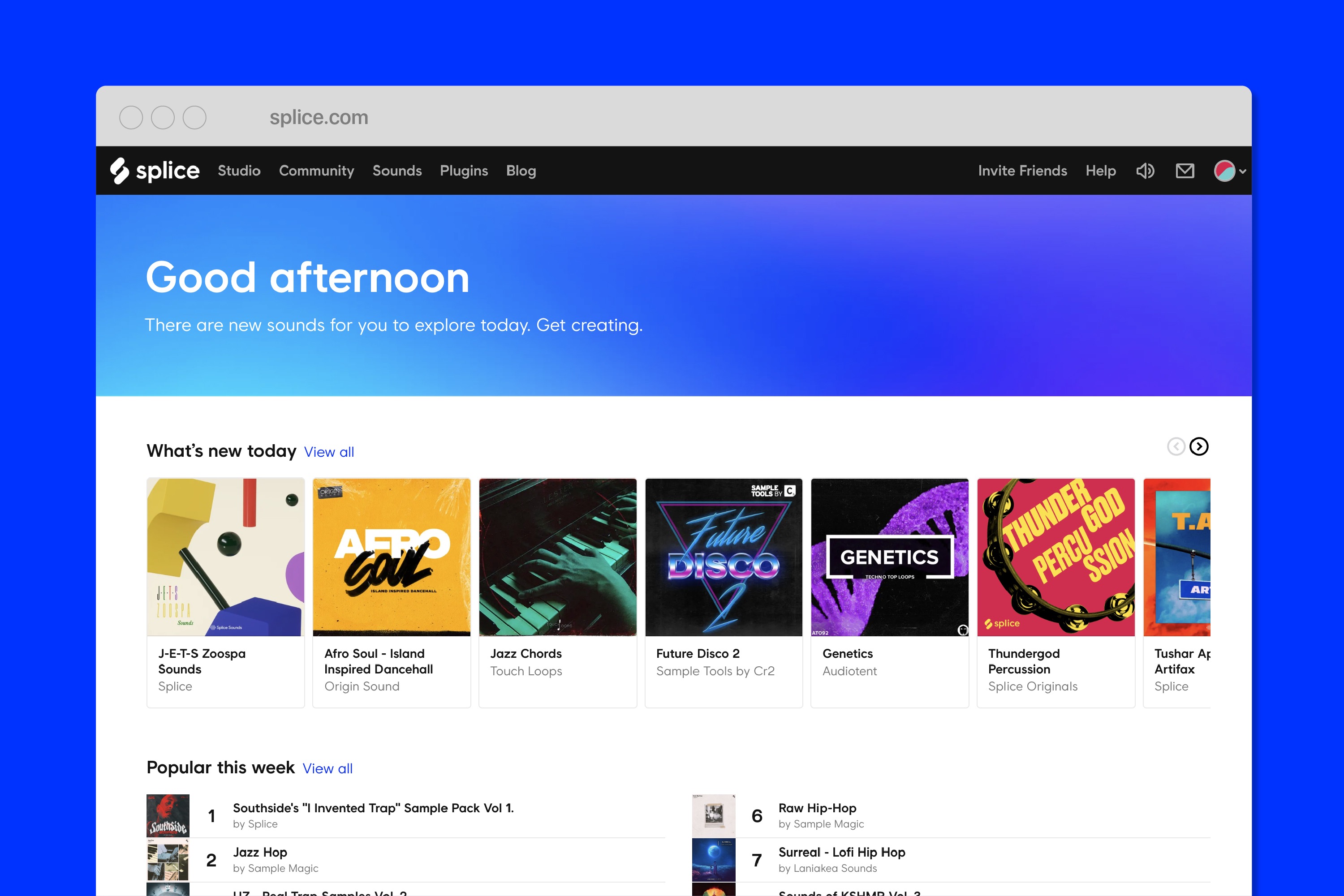
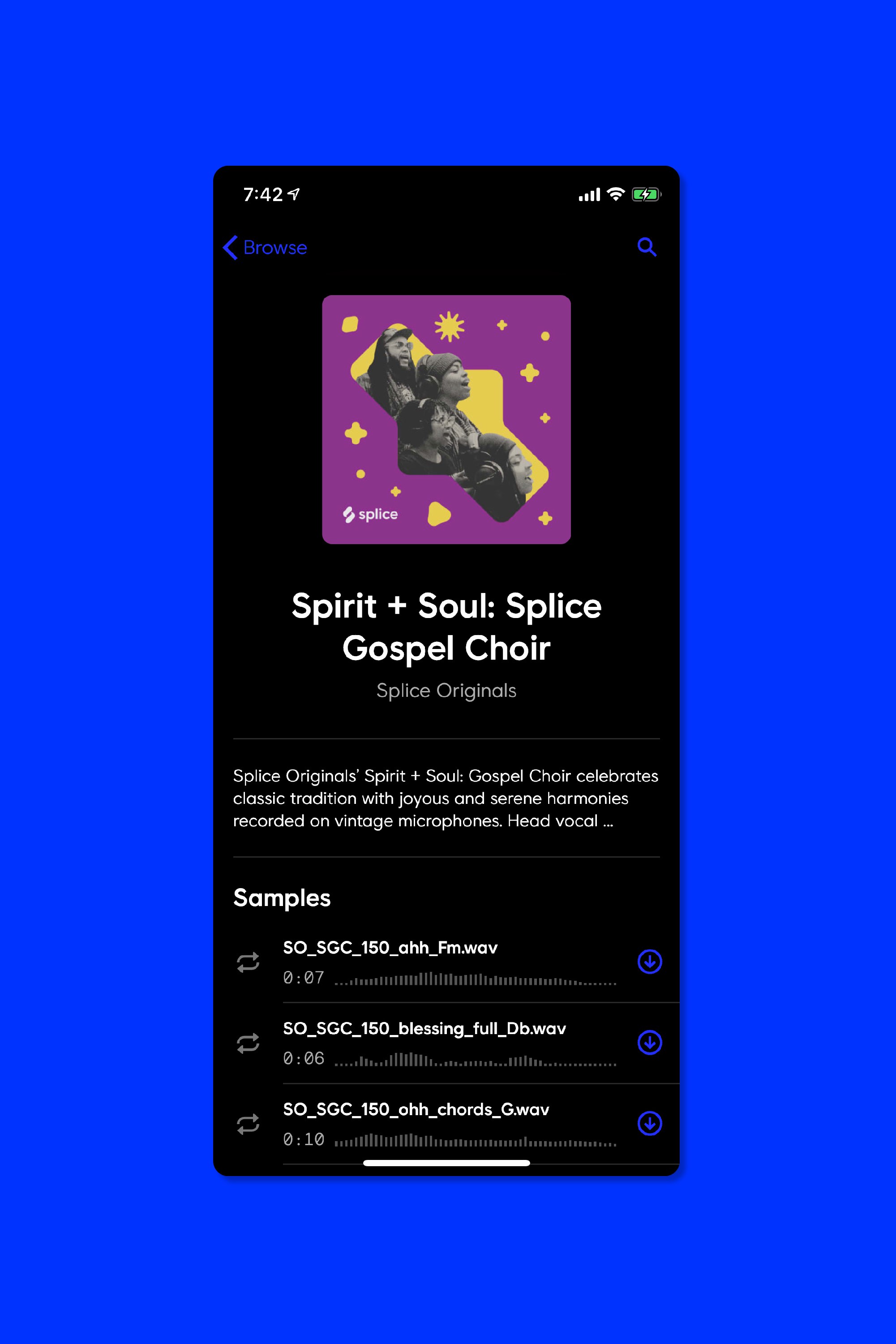

Splice Sans in-use on splice.com and in the iPhone app ︎
Visual Identity ︎ Color
Color plays multiple roles in a brand’s visual identity. It’s important to find a color that both stands out in the competative landscape, and works well in the product itself.
We chose a blue as our primary color for both brand and in-product. For the brand, the blue stands out from the field of greens, oranges, and reds found throughout the music and creator space. For the product, it clearly communicates core actions and messages.


Splice UI & Color Pairings ︎
To accompany the blue, we developed a bold, broad palette of color combinations to use throughout our social channels and other marketing initiatives.
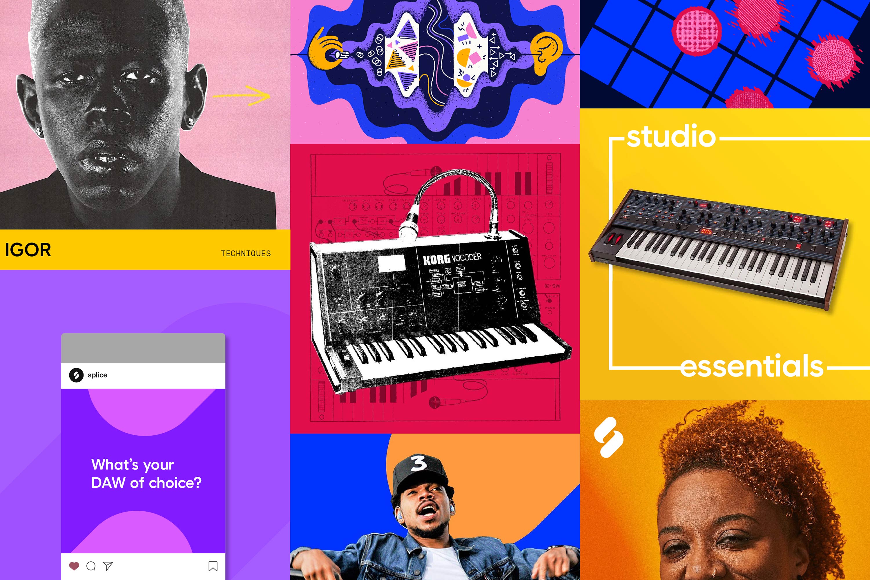
Splice Social Graphics ︎
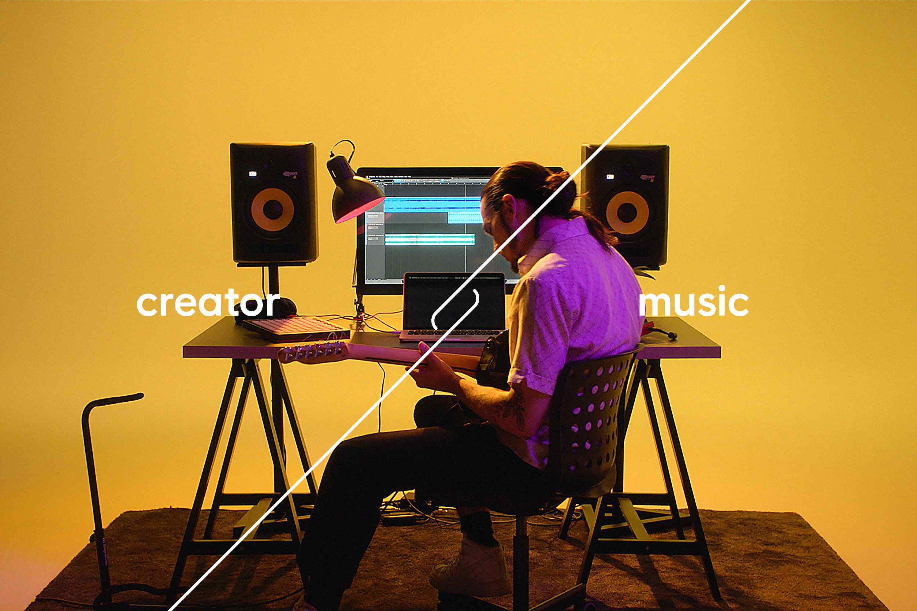
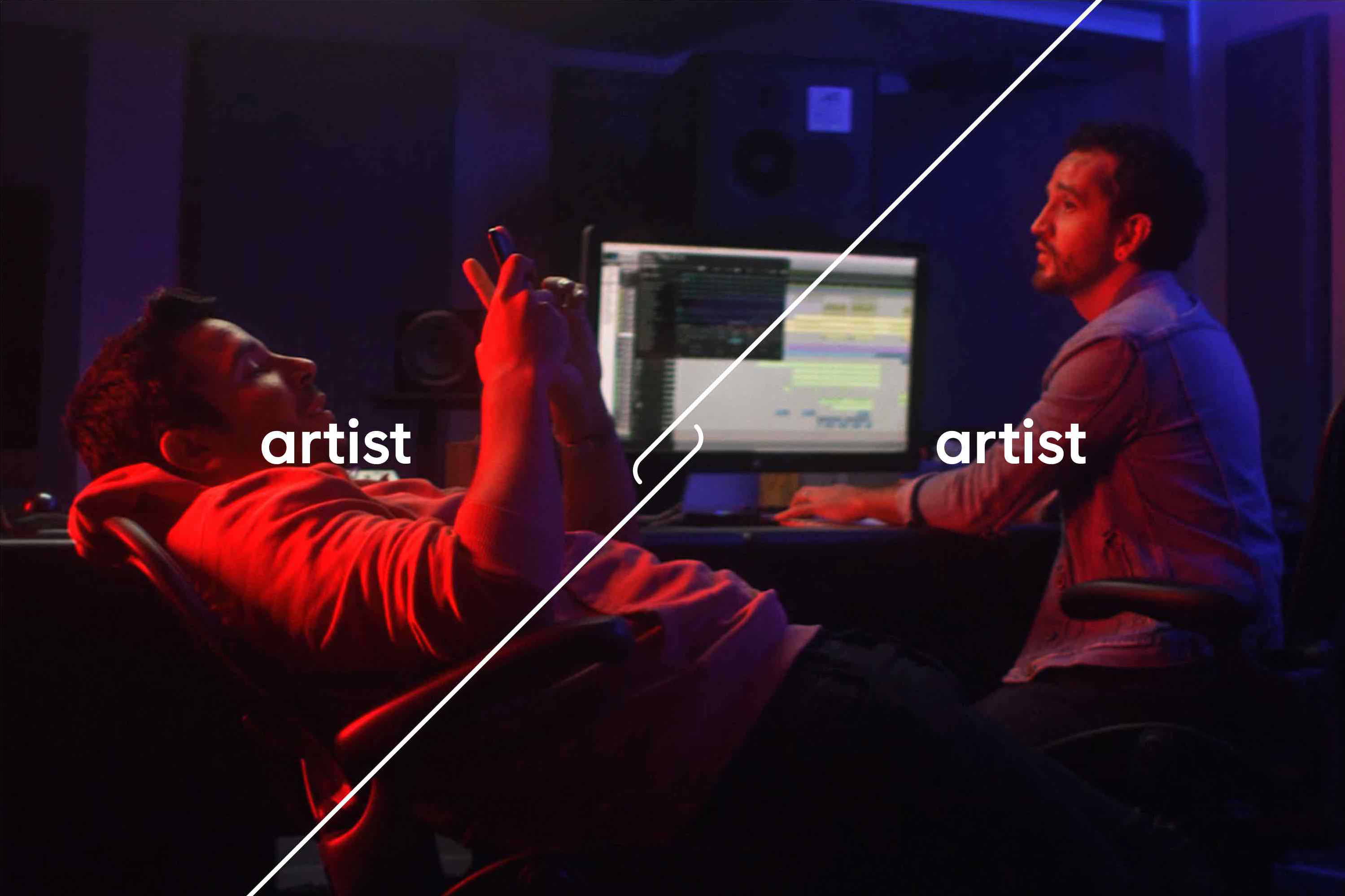
Visual Identity ︎ Photography
Through core brand photography, we want to inspire creators to imagine themselves using Splice to help achieve their creative goals. We aren’t selling physical gear, but instead, digital tools and access to a library of inspiration.
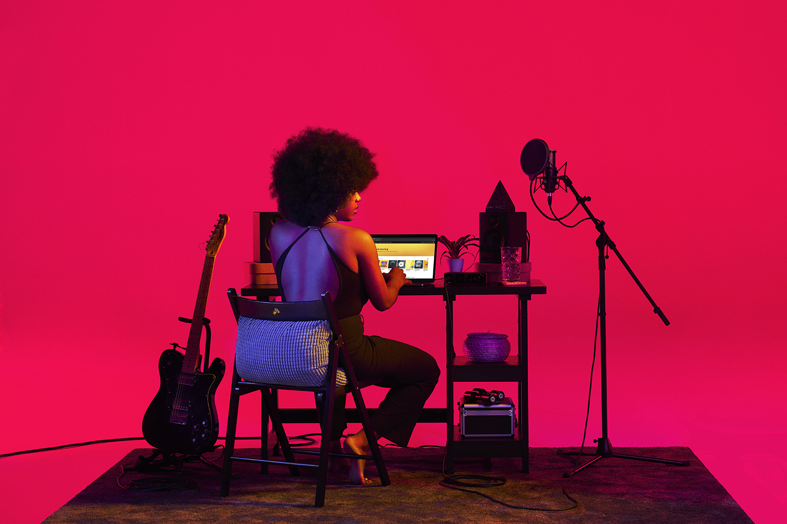
We worked with Robbs, the Brooklyn based Art Director and Photographer duo, to develop a catalog of images that captured the spirit of the Splice brand, representing a diverse range of musical styles and the people that make them.
Each subject was used as the starting point to select colors from our brand palette. Each scene was lit with unique color combinations to represent their distinct creative voice.


Photography by Robbs ︎
Video︎
Building a brand isn’t just about a logo or the system you build around it. It is also the way you speak, show, and share the stories of your community and their creations.
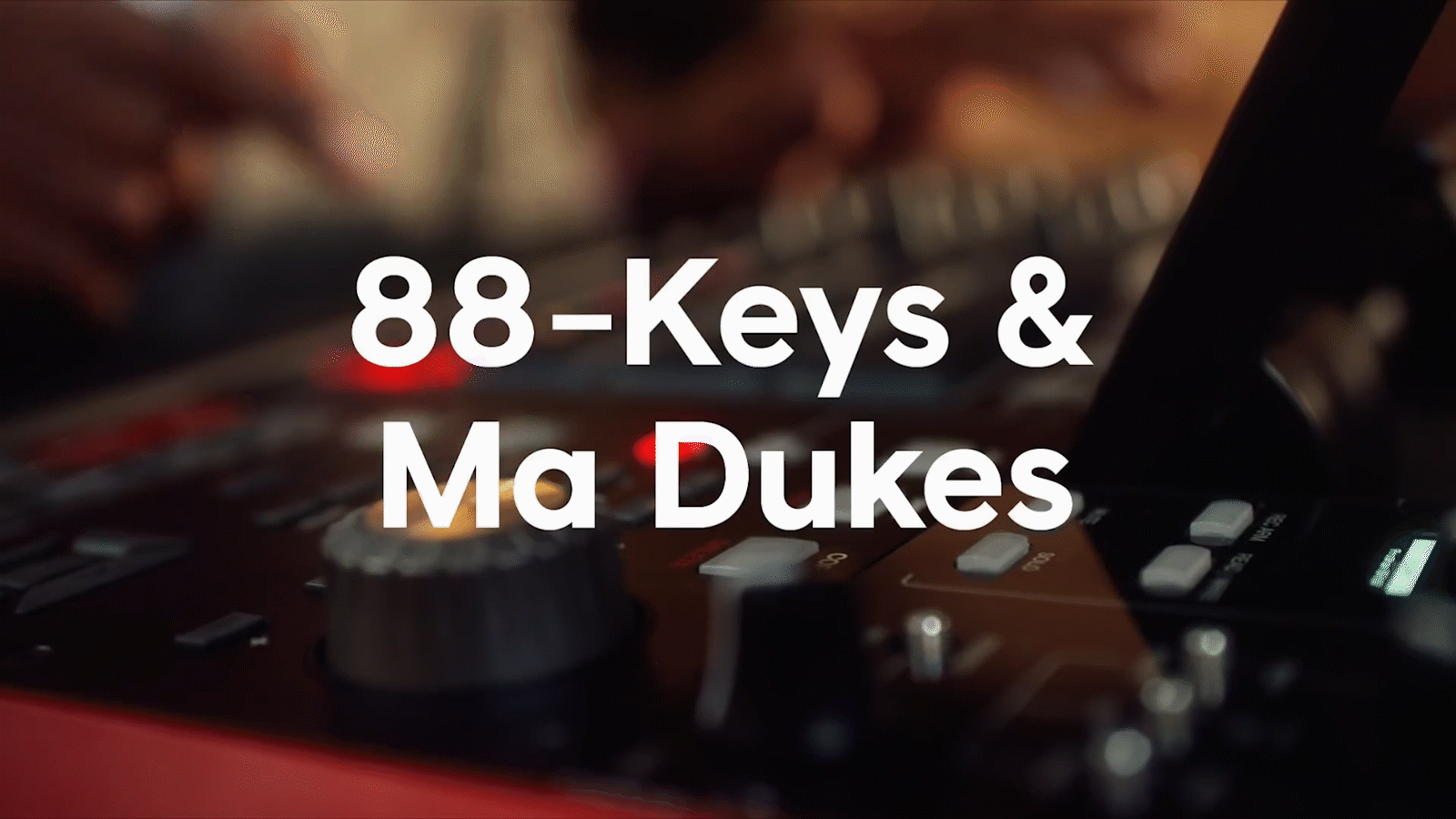
Video︎Product Marketing
Splice speaks beyond abstract creativity. We get technical, share tips, process, and ideas, in hopes of inspiring our users’ next production or even pushing them to start making music in the first place.
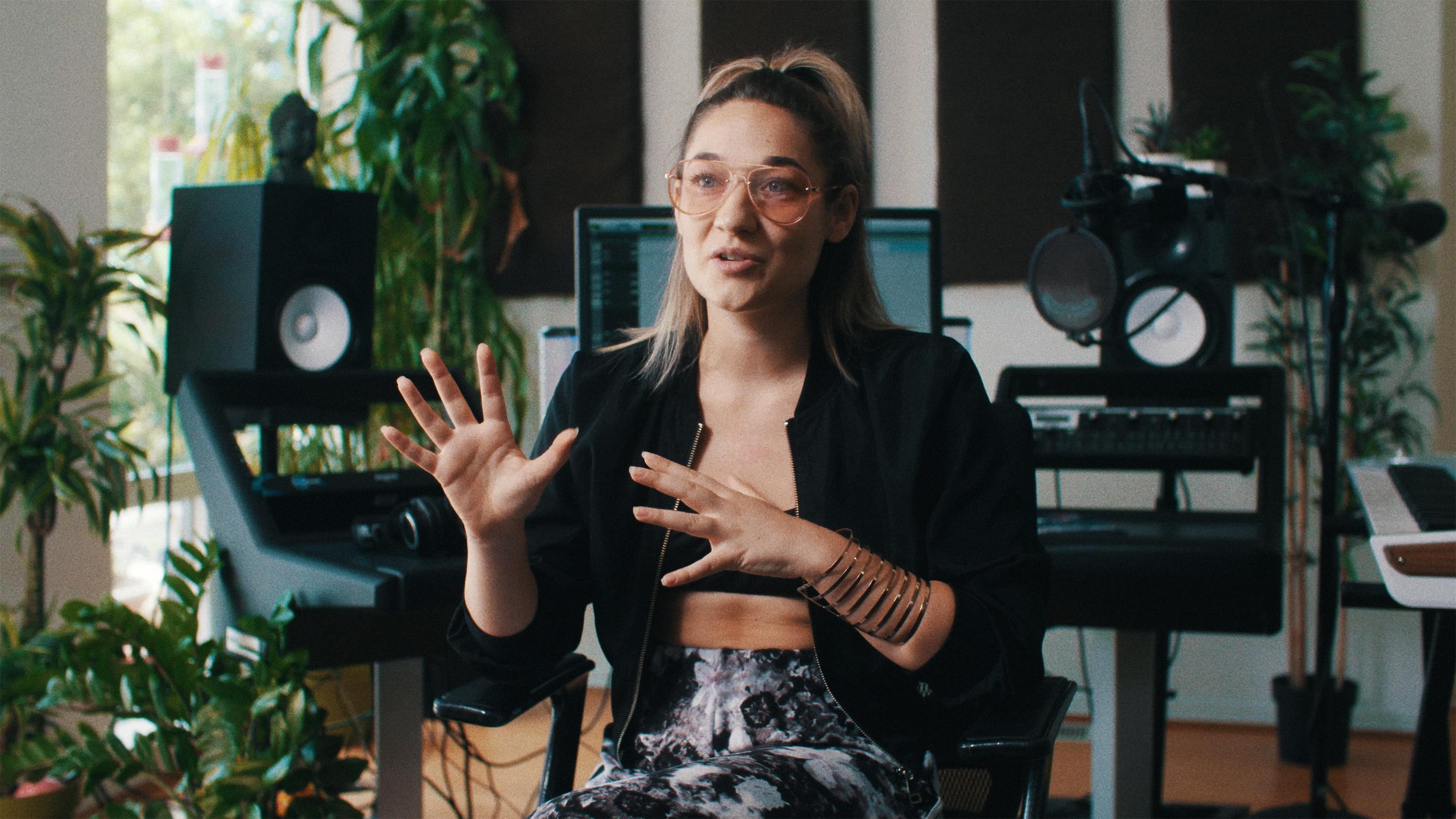
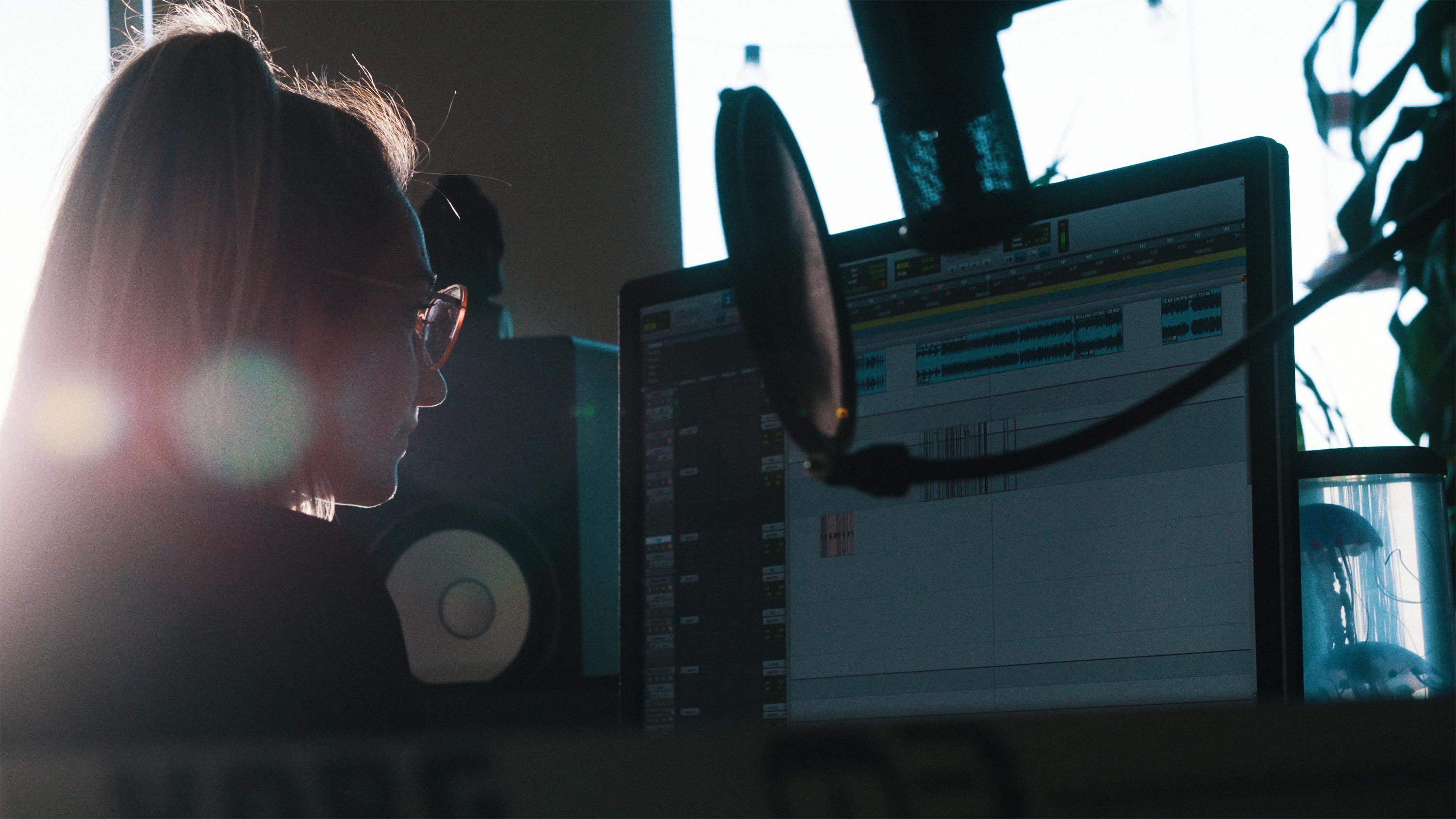
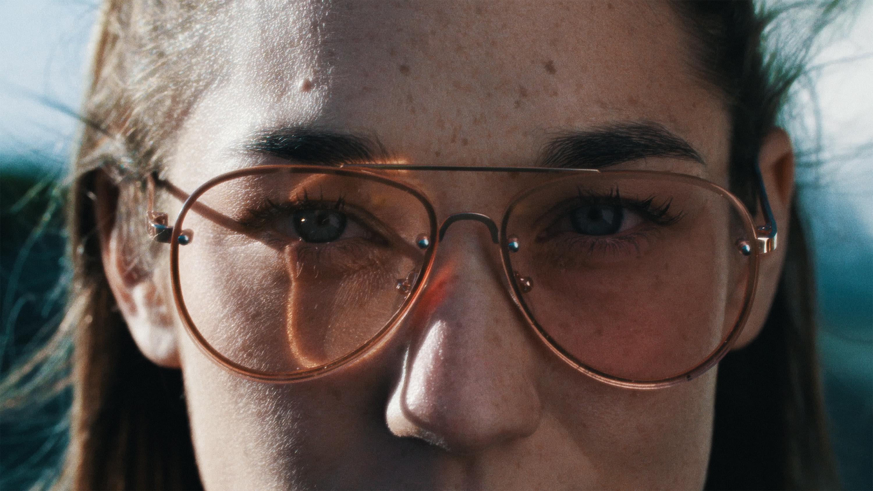
KARRA — Vocalist & Splice Sounds Artist ︎
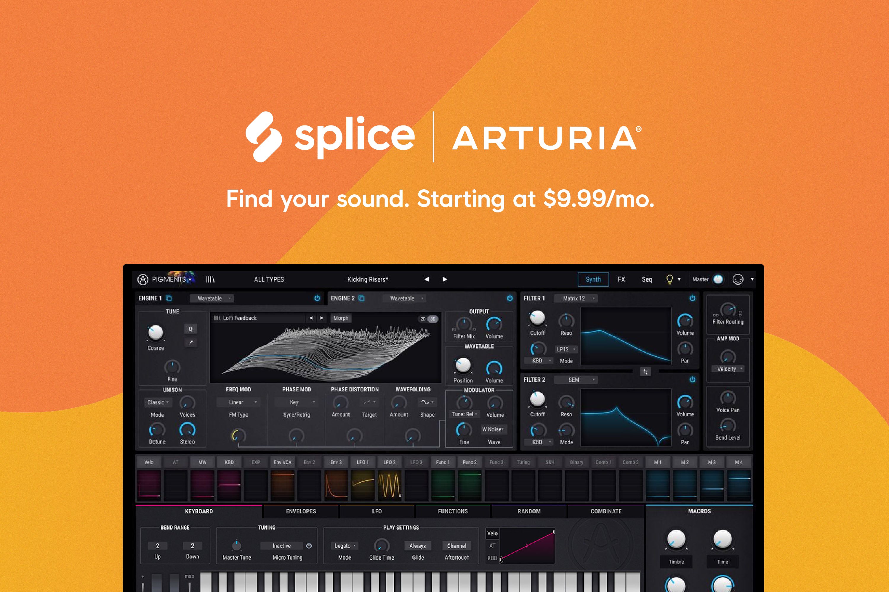
Often the artists we work with through our sample marketplace also use a piece of software available on our rent-to-own plugin marketplace. This allowed us to create compelling product placement videos that were informative, but also more inspirational than your average YouTube tutorial.
We found that artists were excited to talk about something they loved —and it showed. These videos generated hundreds of thousands of views across channels, and led to even deeper relationships with our software partners.
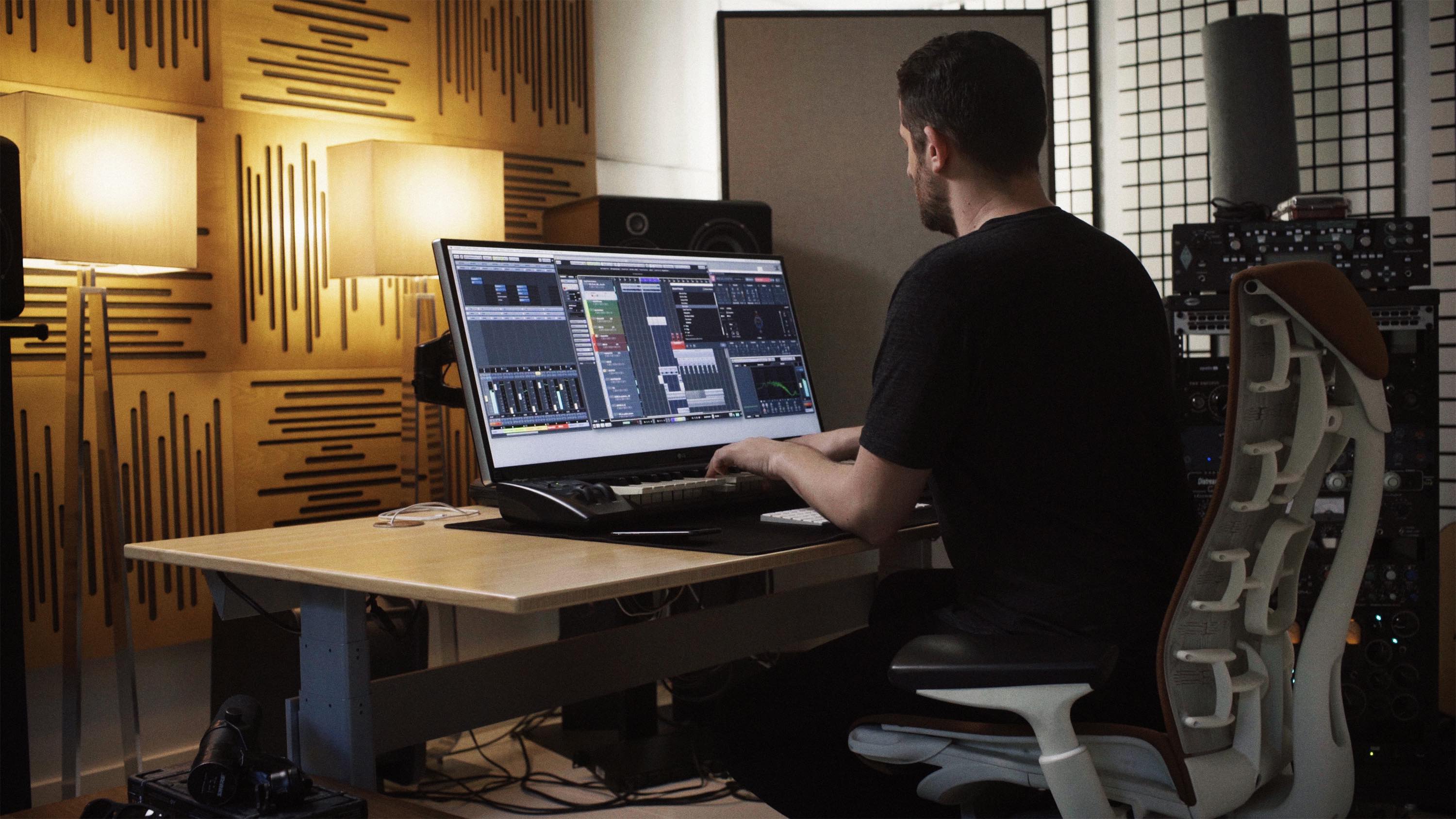

Ian Kirkpatrick — Producer for Selena Gomez, Justin Bieber, Britney Spears, Dua Lipa ︎
Video ︎ Content Marketing
As video proved more valuable in our marketing strategy, and the caliber of artists increased, we found ourselves using the same formula again and again because it worked.
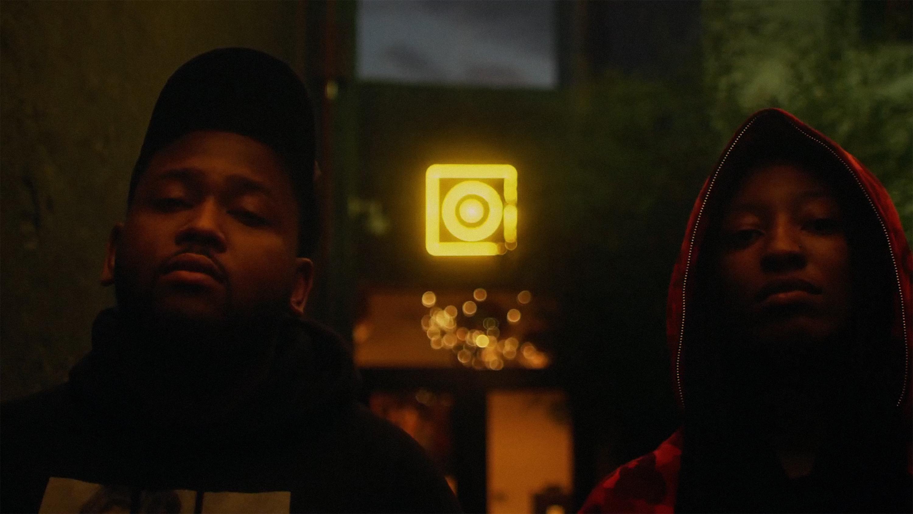
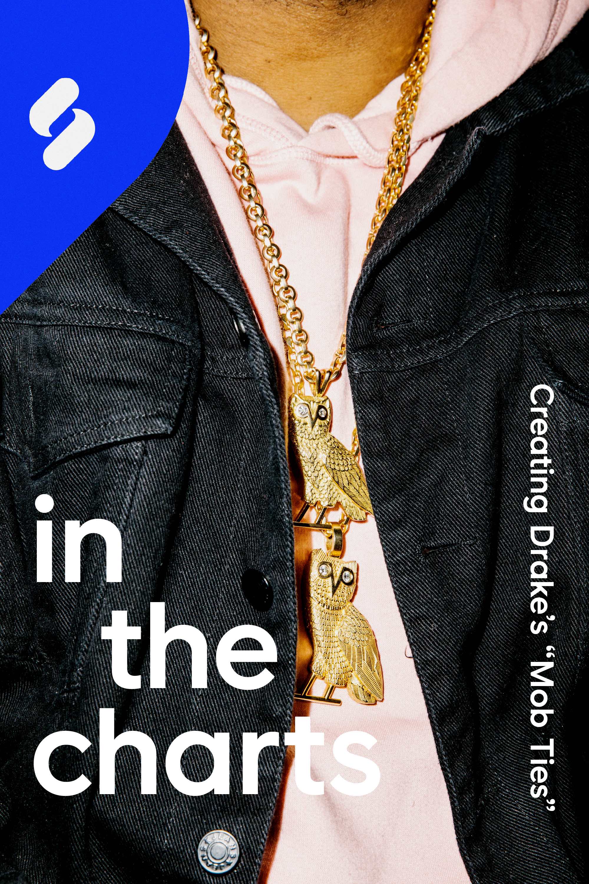
Wondagurl & Boi-1da — Producers (Drake, OVO, Travis Scott, Jay Z) ︎
We worked with LA-based video pioneers Yours Truly to develop our first editorial content series. In contrast to our other videos, which tend to be more technical and marketing-driven storylines, this series took a more cinematic approach.
In the inaugural episode, Andres and Mauricio (Daddy Yankee, Justin Bieber and Luis Fonsi’s “Despacito”), discuss their workflow and production process in creating their own Splice pack. Watch it below and read more about the Unpacked series here.
My Role ︎
Creative Direction, Strategy, Copywriting, Project Management
Project Credits & Collaborators ︎
︎ Rebrand Team
Creative Director
Chris Muccioli
Designers
Jay Schaul
Emily Haasch
Product Design
Steven Neamonitakis
Andrew Cornett
R/GA
Strategy
Stephen Piri
Anna Bulman
Severine Bavon
Designers
Matias Alvarez
Robert Northam
Copy
Russell Norris
VP of Marketing
Laura Zax
Chief Product Officer
Ryan Walsh
CEO
Steve Martocci
Product Managment
Azza Elsheikh
Engineering
Lara Warman
Jess Eldredge
Agencies
R/GA London
Order
OMSE
Photography
Aaron & Julia Robbs
︎ Splice Brand Team
Creative Director
Meg Vazquez
Designers
Shak Greeley
Casey Jabbour
Alex Cook
Copywriting
Simon Goetz
Creative Director
Meg Vazquez
Designers
Shak Greeley
Casey Jabbour
Alex Cook
Copywriting
Simon Goetz
︎Other Collaborators
Video
Tomasz Werner
Yours Truly
Video
Tomasz Werner
Yours Truly