Jukely Relaunch
Evolving a product & brand from a free to paid membership.
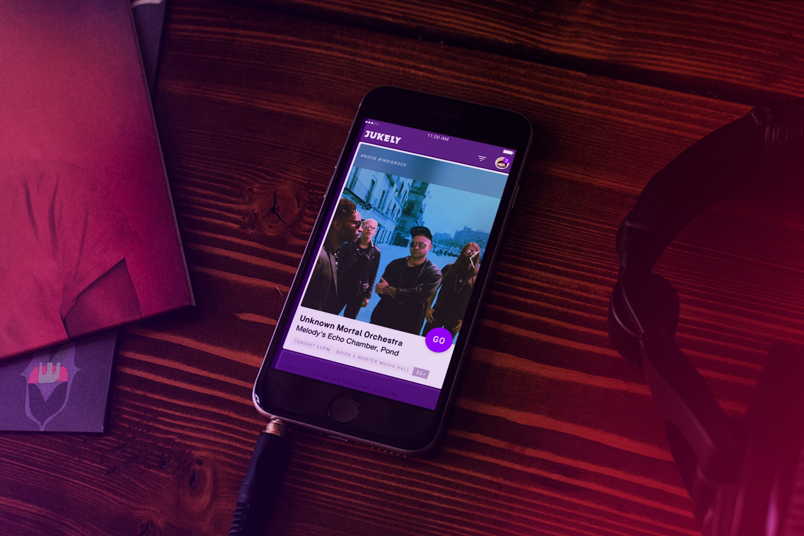
Jukely is the worlds first concert subscription service, with the mission of getting people to see more live music, more often. It encourages live music discovery by simplifying the process and price of shows to one monthly fee. Working in partnership with venues and promoters they aim to assure artists play to as many people as possible and hopefully gain new fans as a result.
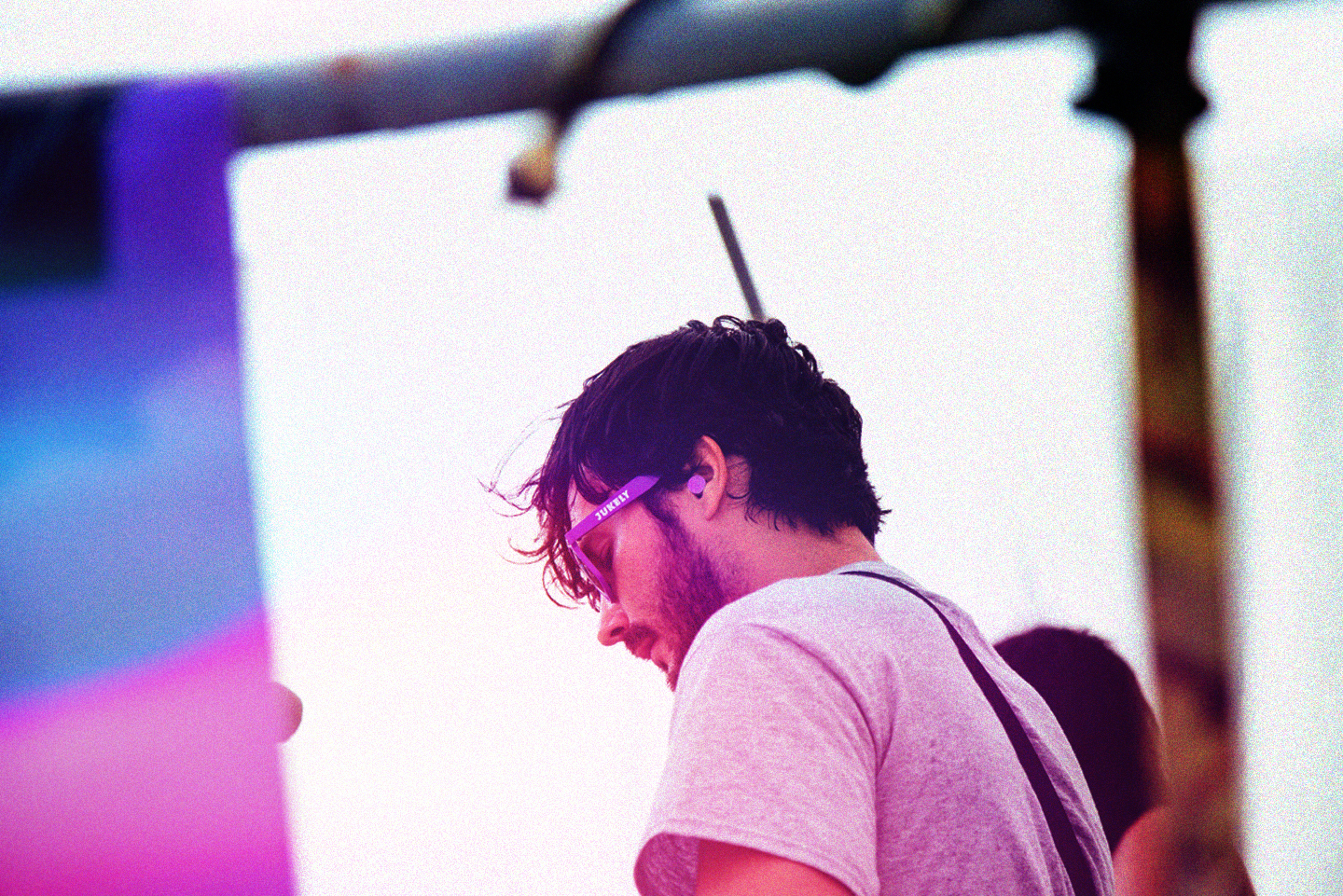
︎ Unknown Mortal Orchestra play a Jukely Members Only event in San Fransico


Visual Identity
︎ Logo
At the start of our redesign process we knew we wanted to maintain the general form of the Jukely mark. It had character, brand equity, and was recognizable amongst the other brands in our space.
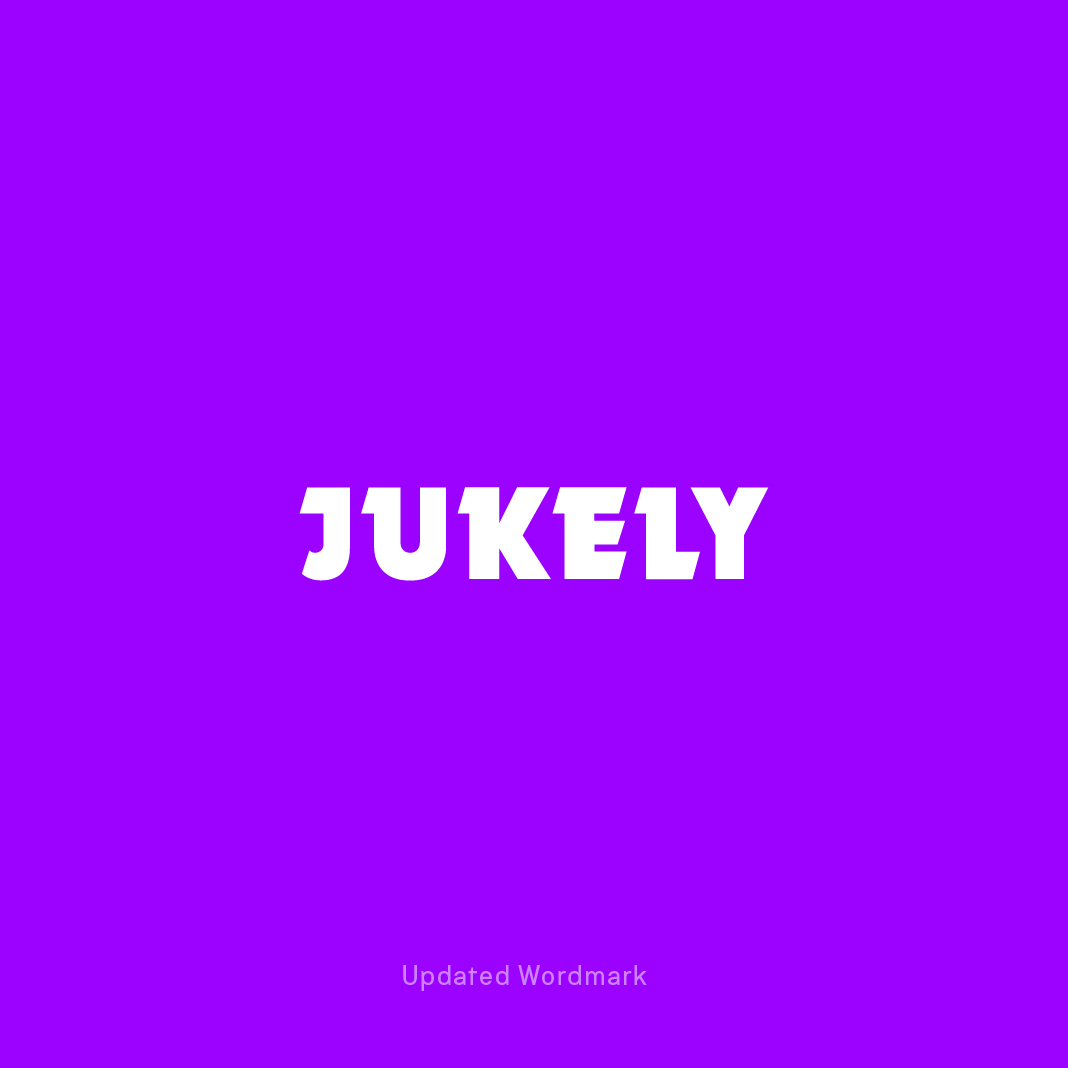

As we started to work through product ideas and implementation it became apparent that adjustments needed to be made for legibility and scaling. We paired the letterforms down to their core shapes and tracked the individual letters out for better balance and readability.
Visual Identity
︎ Typography
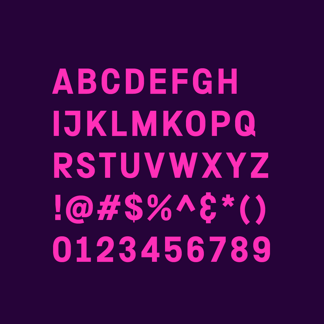
When selecting a typeface we looked for one that had character, and was ownable in our space. We also needed one that would work well within the product interface, paying particular attention to legibility at small sizes in dates and meta information.
Copy by Philipp Herrmann ended up being our final choice. It’s squared off letterforms closely mimicked the blocky characteristics of the Jukely wordmark itself, creating a cohesive typographic and logo pairing, and it’s letterforms had a off-center approachability to them that re-enforced the fun, nightlife vibe.

Visual Identity
︎ Color
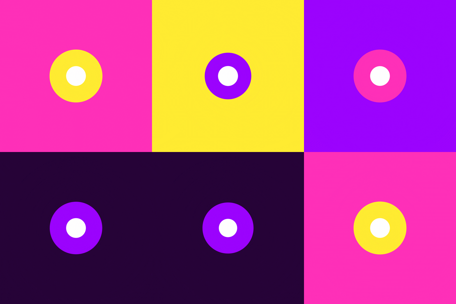
For color, we looked to the stage for inspiration. Similar to a computer screen — LED stage lights use the colors Red, Green, and Blue to generate all the colors of the rainbow. We focused on the overlap these colors made to define our core pallette.


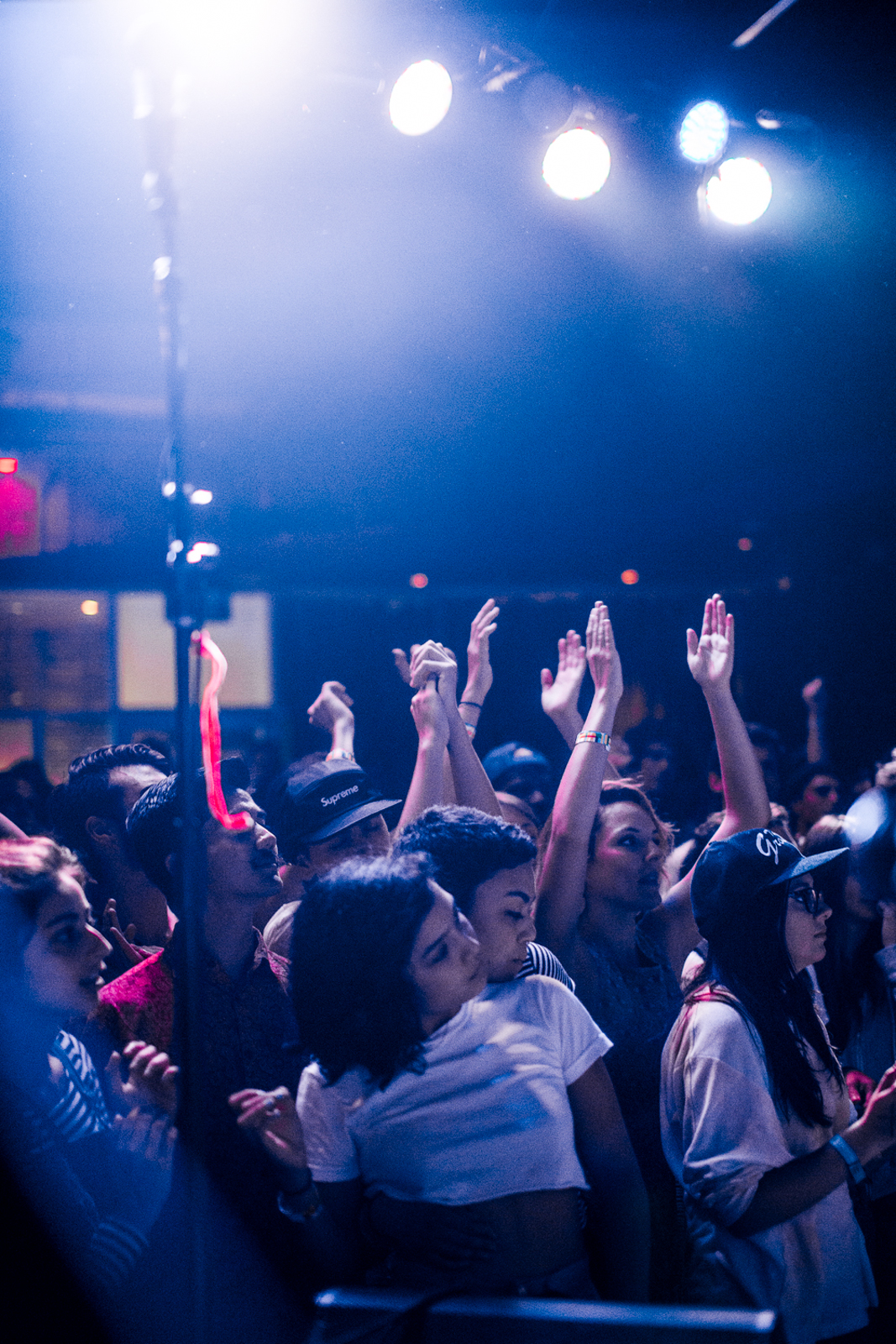
︎ Slow Magic at a Jukely Sound Projects event in New York
Product
︎ Navigation
The apps primary navigation revolves around a linear, vertical scroll. Users browse the list chronologically by swiping up and down, and explore a shows details by swiping left and right.
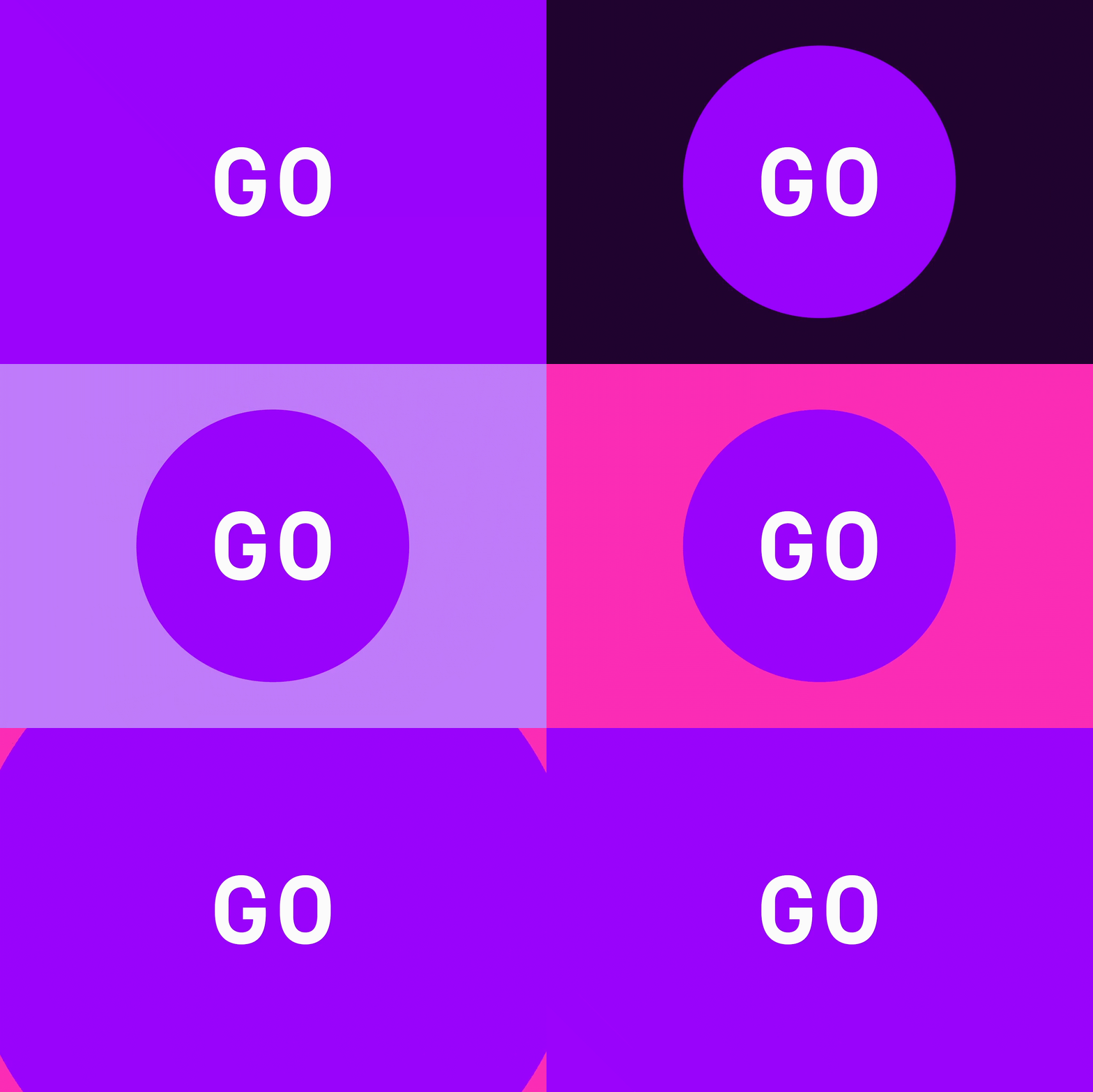
Our goal was to get people to find an event and experience live music in person. We took a cue from Googles Material guidelines with the GO button. Clicking GO on any show immediately took you through the flow of getting on the Jukely guest list, and ready to attend the event.
Product
︎ Messaging
The Jukely audience ranges from teens to young adults in their late 20s. Pretty much anyone with the energy to go see a show at least twice a week. Our product copy utilizes a tone that is active, sometimes provocative, and always encouraging. Time based color schemes and dynamic headlines helped subtly convey the state of the app, and kept it feeling fresh and alive at every refresh.
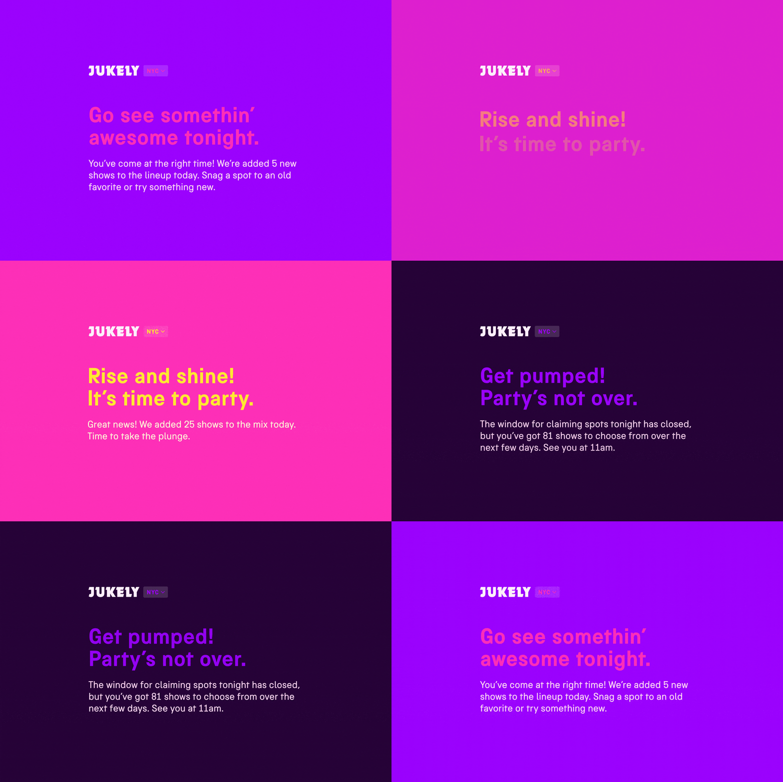
The Jukely brand is young and of the moment. It reacts quickly to pop-culture, it’s users, and the industry. We leverage and amplify everything from twitter trends, app store reviews, and chatter found in Jukely facebook groups and slack channels. This keeps our voice and visual aesthetic bright, colorful, and fun.


Brand
︎ Experiential
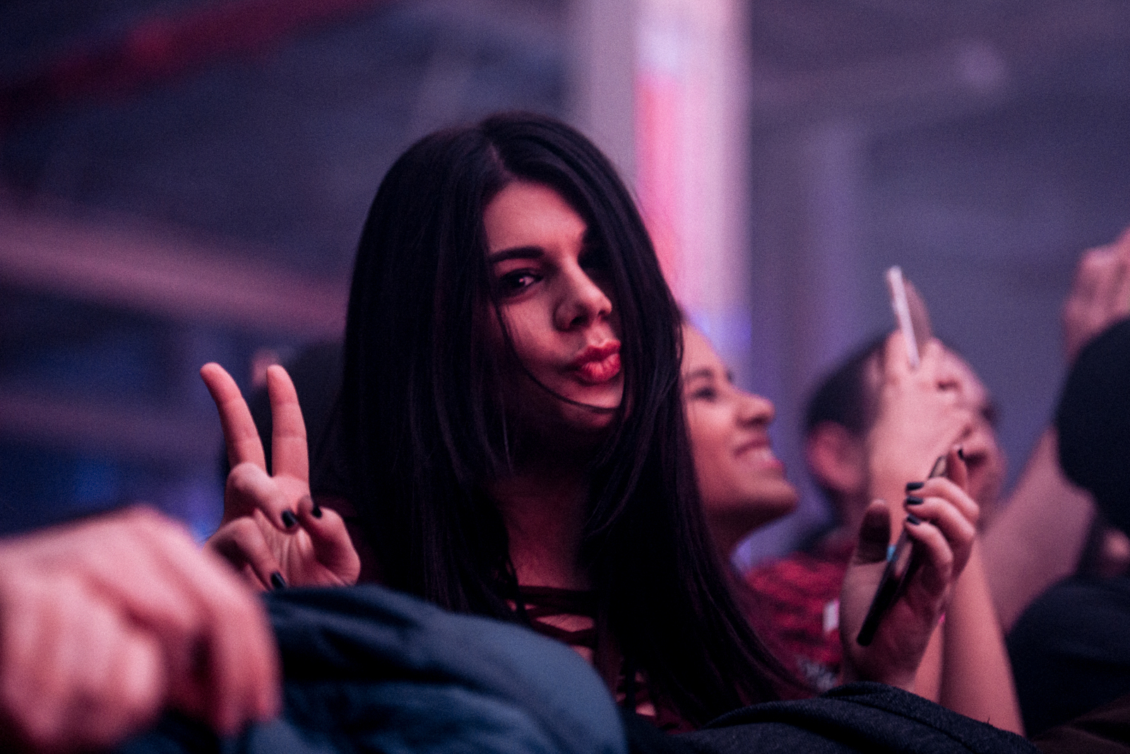
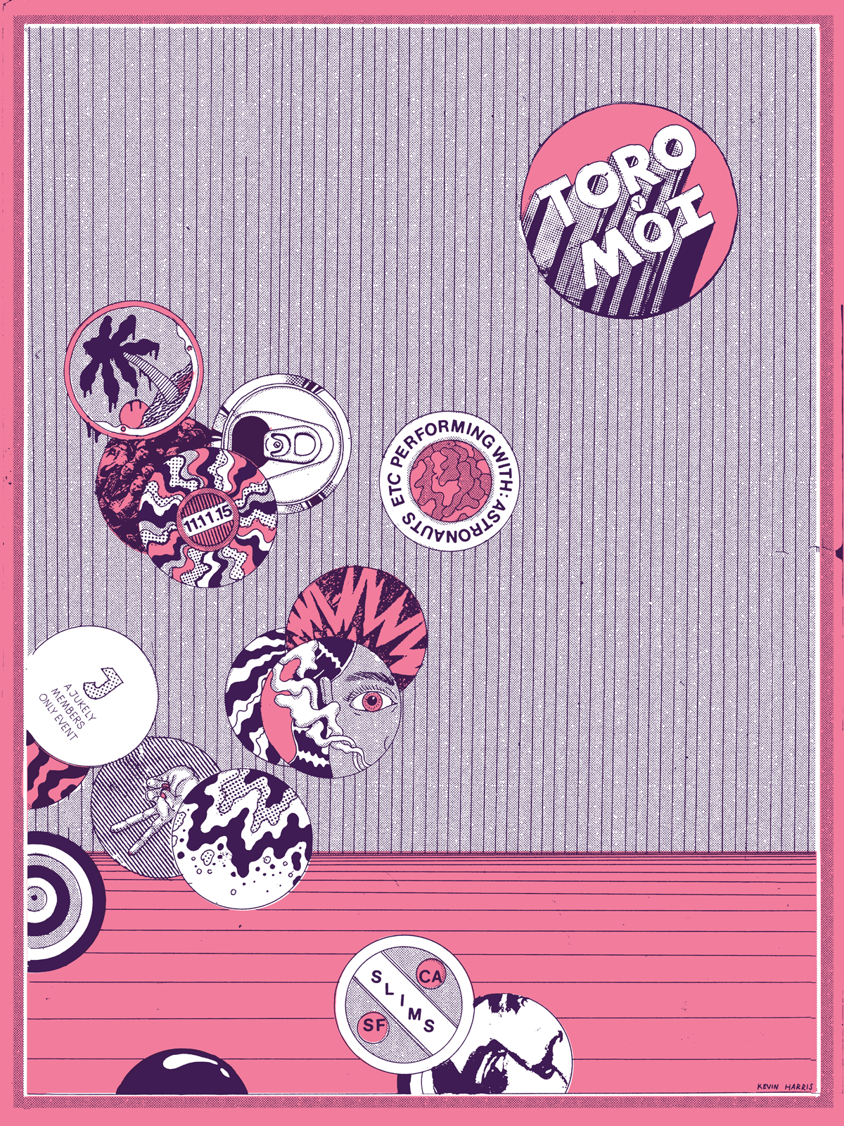
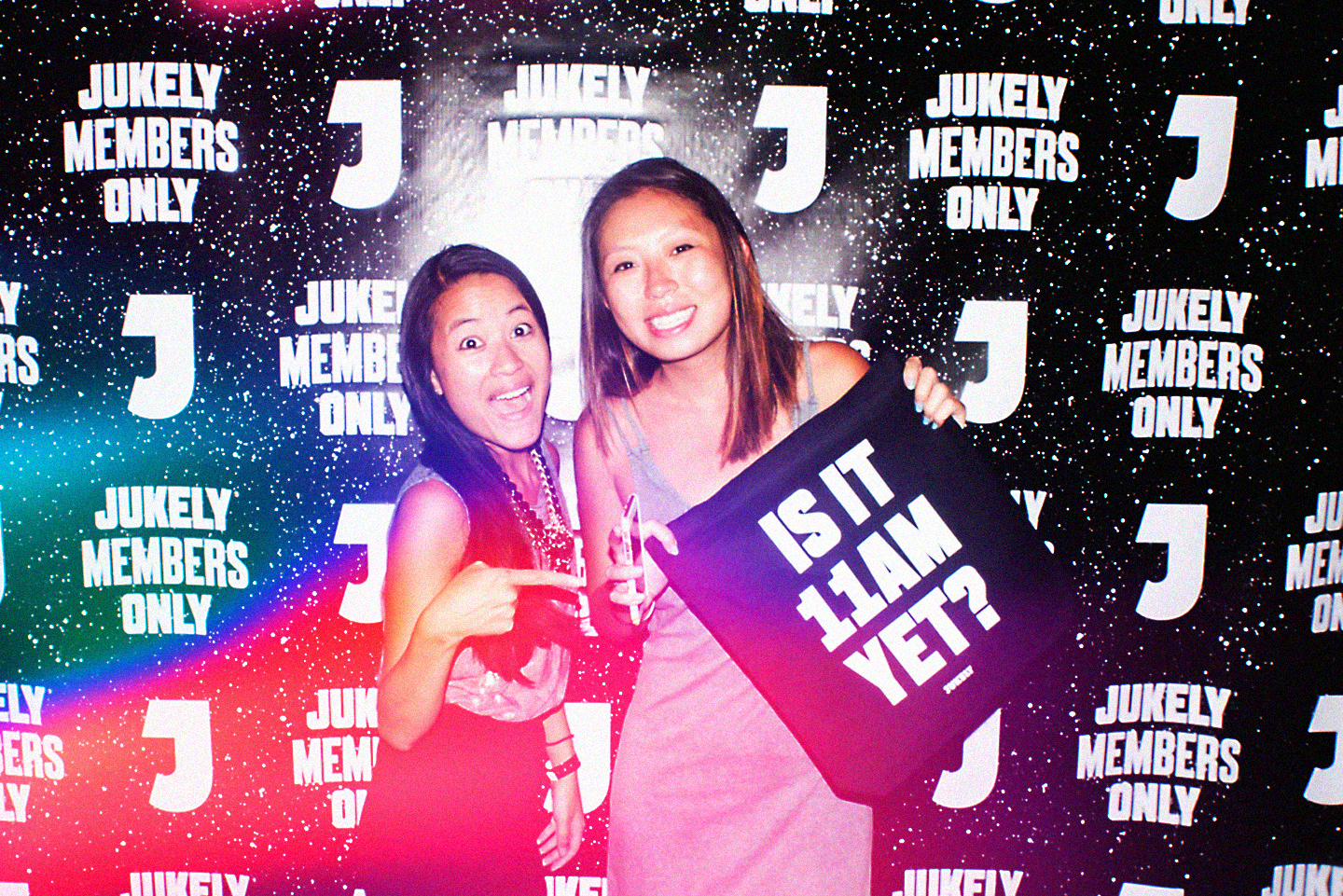
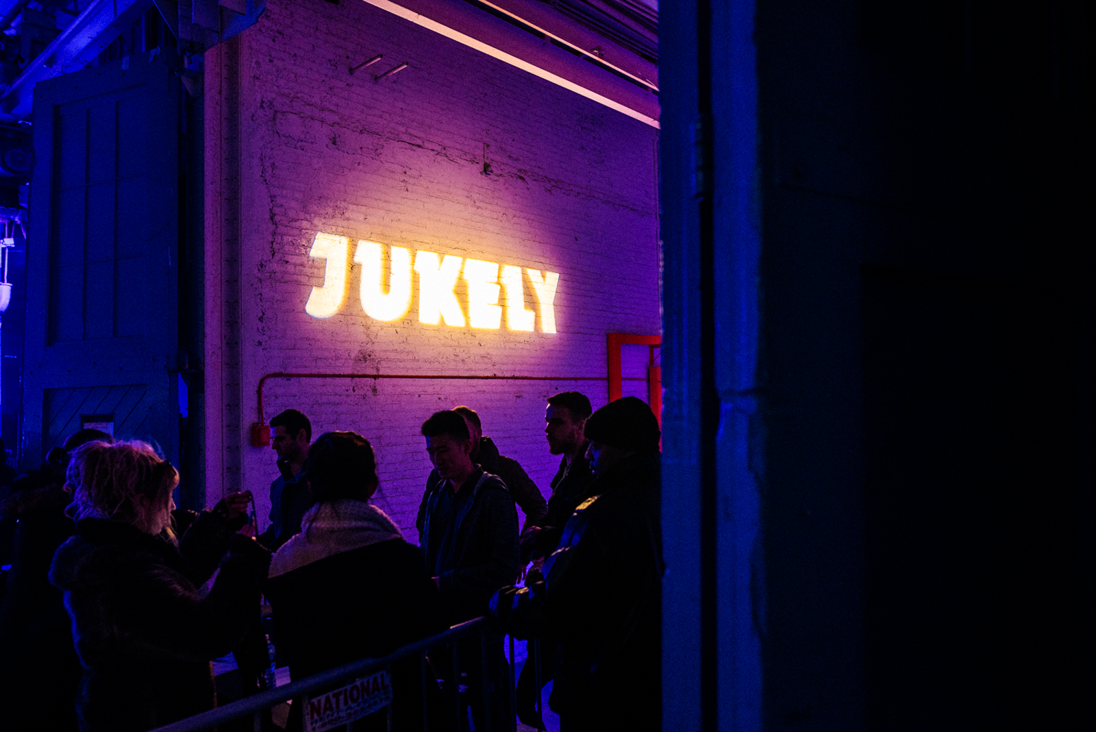
Jukely hosted a series of events only for Jukely Members at small venues across the country featuring performances by Courtney Barnett, The War On Drugs, Hot Chip, Unknown Mortal Orchestra & more. Branding at these events was distilled down to a simple, iconic, and glowing J that acted as a subtle nod to the app powering the event.


My role ︎
Creative Direction, Design, Project Management, Product Management
Credits & Collaborators ︎
Creative Direction
Chris Muccioli
Product Design
Jordan Obi
Jay Schaul
Nikki Lee
Trevor Rogers
Copywriting
Jordan Obi
Allison Baughman
Brand Design
Ronin Wood
Engineers
Sam Cole
Joe Deleeuw
Dan Katz
Chris France
Events & Partner Relations
Jenny Mott
Stephanie Almache
Diana Lease
Hayata Ishikawa
Karolina Mozdzynski
Elizabeth Goodman
CEO
Bora Celik